Overview
Going back to 1928, these graphs give some historical context for the age-old conversation of investing in stocks versus Treasury bonds.1
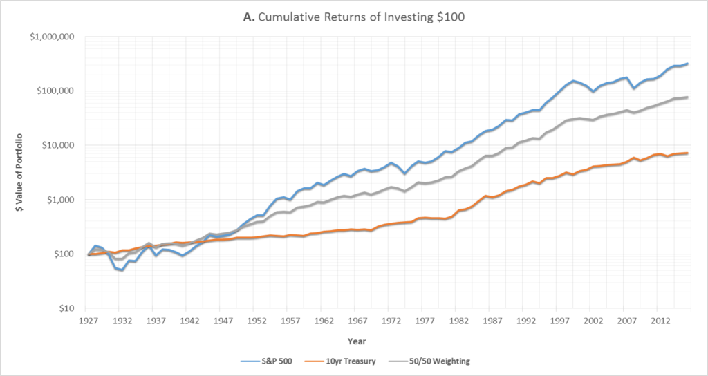
As shown in Graph A above,2 investing in the S&P 500 since 19283 would have returned nearly 4,500% more than investing in 10yr Treasury bonds.4 Assuming the initial investment was $100, the stock portfolio would have grown to above $320,000 vs only $7,000 for the bonds.5
However, this outperformance comes with a cost – the S&P 500 is significantly more risky. As shown below in Graph B, the worst year for the stock portfolio was 1931, where the market lost 44% of it’s value. If a portfolio had instead been 50/50 weighted in stocks and bonds, the loss for that year would have been reduced to 23%.
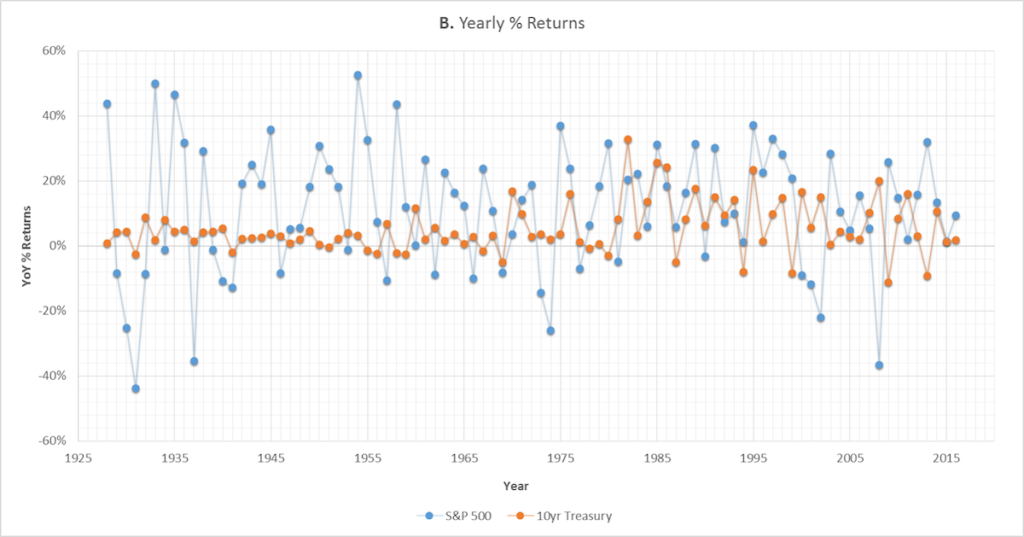
In 2008, bonds would have provided an even greater protection against loss. If the portfolio had been 50/50 weighted, the 37% stock market loss would have been reduced to an only 8% loss.
The conventional narrative is that Treasuries are safe-haven assets – the theory is that they’re supposed to gain in value when the stock market is panicking since investors are assumed to be taking the proceeds from selling stocks and putting them into Treasuries.6
As shown above, it’s true that, at least in some extreme scenarios, bonds can retain their value while the stock market is tanking. However, how has this relationship historically looked?
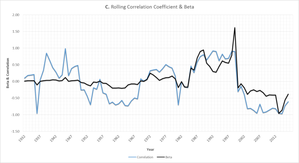
As shown in Graph C, it appears that, since around 2000, Treasuries have consistently moved in the opposite direction as stocks – in other words, the black (beta) and blue (correlation) lines are both comfortably below 0.
However, as shown above, the notion that Treasuries generally move in the opposite direction of stocks is a relatively recent phenomenon.
Looking at the bigger picture, the data indicates that there has been almost no long-term relationship between 10yr Treasuries and US stock returns – the average correlation coefficient7 for the past 89 years has been just -0.04.8
There are periods when bonds move the same direction as stocks and when they move the opposite, but this relationship has fluctuated significantly over time – additionally, the beta9 for the entire 89 year time period is essentially zero (0.03).
Even when filtering down to periods of stock market stress where stocks have dropped by more than 10%, the expected inverse stock vs bond relationship hasn’t been especially reliable. Stocks and bonds actually have a slightly positive correlation during these market downturns.
Something else to note from Graph C above is that bonds prices didn’t really move much up until around the 1980’s – the beta doesn’t even reach a magnitude of over 0.5 until then.
So it seems that something might have changed within the last 15 to 30 years. Displayed below in Graph D is the historical CPI10 and 10yr Treasury yield:
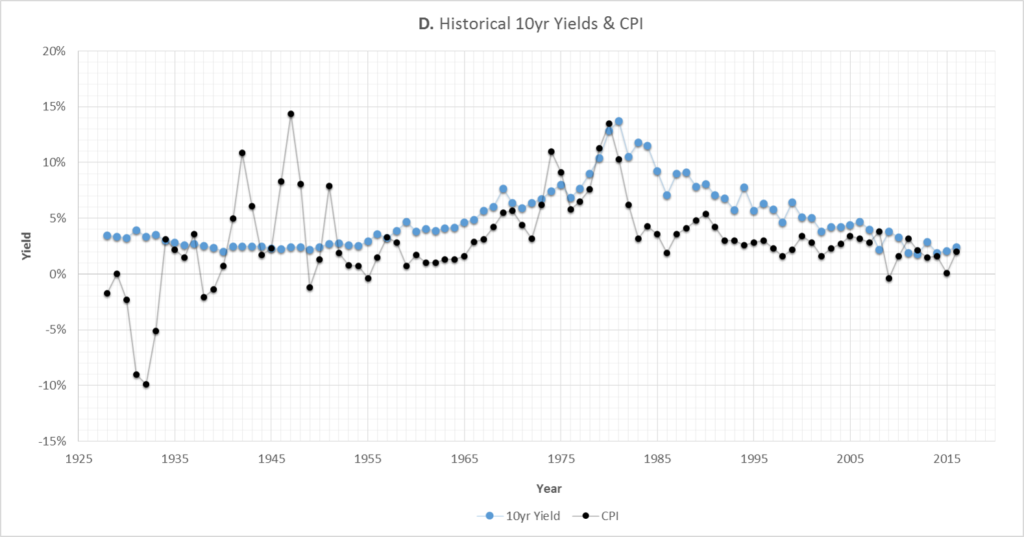
As shown, the CPI experienced huge swings up until the end of World War 2. Since then, the CPI and Treasury yields have had a relatively tighter relationship, which is at least what would be academically expected.11
The other big trend to notice is that yields have been almost falling almost continuously since 1981. Since bond prices increase when yields decrease, this means that since 1981 bonds have been on average returning significantly more than just their coupon payments.
More specifically, due to the overall trend of yields falling over the past 35 years, price appreciation has accounted for approximately 1/3 of the total return from 10yr Treasuries (coupon income made up the other 2/3).
One other item to note is that, from a historical perspective, there isn’t much more room for Treasury yields to fall.12 There is, however, plenty of room for yields to rise and still be within their historical norms – which would likely mean significant losses for Treasury bond owners.
Graph E below illustrates this concept. The x-axis is yields and the y-axis is the average total return from holding a Treasury over the subsequent 10 years. For example, the top-right-most point (located at about 14% yield, 10% return) means that when a Treasury yielded 14%, the average return over the next 10 years averaged 10% per year.
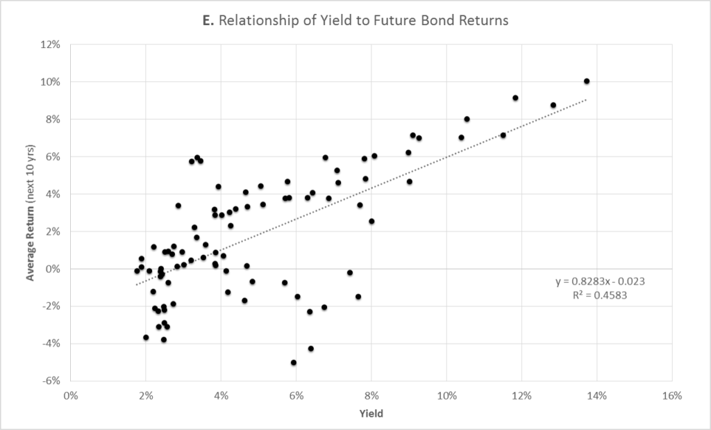
As shown, the general trend is that the lower the current yield, the lower the total return over the next 10 years.
Note that once yields get below 3%, historically these periods have actually been associated with an eventual average loss to bond owners. A main factor to consider here would be, as mentioned above, yields don’t have much room to fall but have plenty of room to rise.
Back to discussing both stocks and bonds, Graph F below shows what the total risk/reward has looked like over the past 90 years.
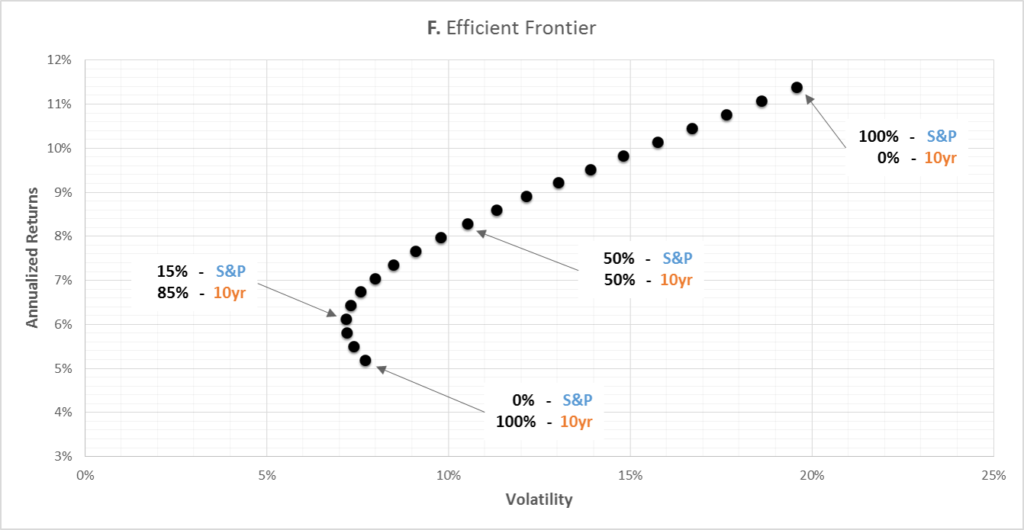
As shown (and as conventionally expected), stocks have shown both higher returns and higher volatility.
The average annual return of a 100% stock portfolio is 2.2x greater than a 100% 10yr Treasury portfolio, while the volatility of the stock portfolio is 2.5x greater than the volatility of the bond portfolio.
What about inflation?
So far, all returns discussed in this article have been without accounting for inflation. As shown in Graph G below, once you account for inflation,10 the total returns for all investments are much smaller.
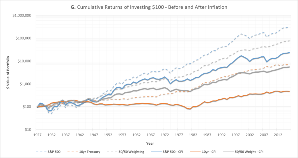
For investing $100 in the stocks-only portfolio back in 1928, the inflation-adjusted portfolio is now worth only $24,000, versus $320,000 before inflation. It’s even more grim for the bonds-only portfolio: the inflation-adjusted portfolio is worth only $480, versus $7,200 before inflation.
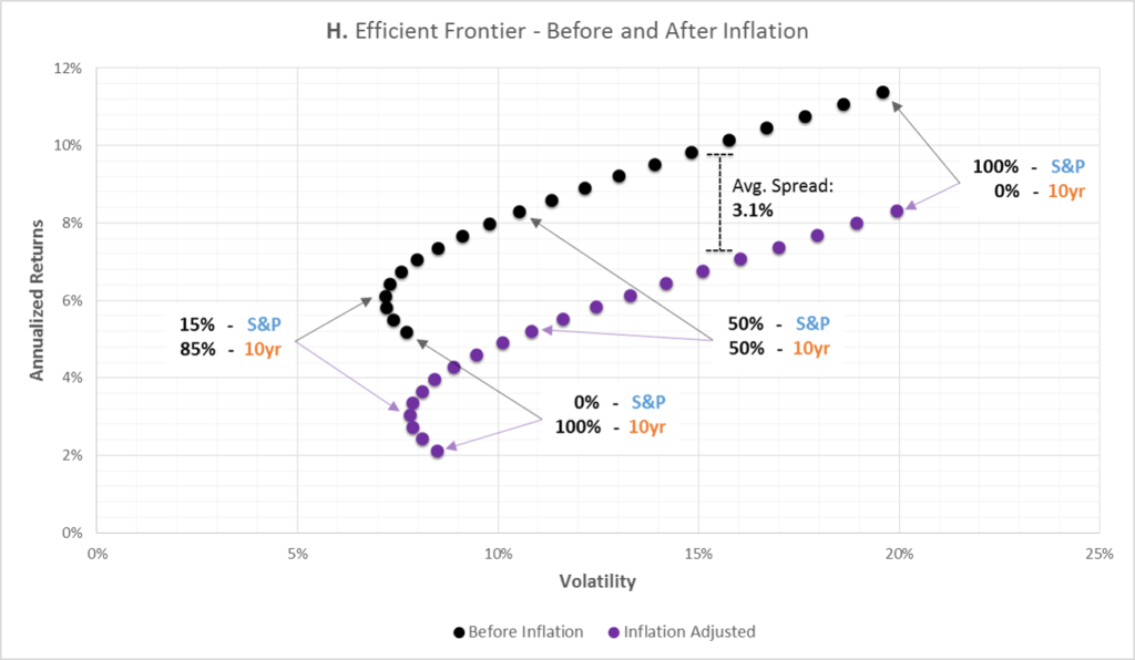
Finally, Graph H below shows what the risk/reward looks like both before and after inflation. The general risk/reward properties of the inflation-adjusted portfolio are similar to the pre-inflation portfolio – except now the inflation-adjusted portfolio approximately 3.1% lower annual returns, on average.
3.1% might not seem like much, but as previously shown in Graph G it could eventually be the difference between $24,000 and $320,000.
Putting it all together
When it comes to owning assets that are risk-free13 but still offer at least some return, Treasuries are hard to beat. And since 1928, investing in Treasury bonds has certainly been less risky than investing in stocks. However – especially after considering adjustments for inflation – some might say that this reduced risk could have been achieved at too great a cost.
Disclaimer
This is not investment advice–please see the disclaimer.
Notes
- For the purposes of this article, the S&P 500 is used to represent the stock portfolio and the 10yr Treasury bond is used to represent the bond portfolio.
- All taxes, fees, commissions, and market impact costs are assumed to be 0 for this article. Here is a link to the one of the data sources for this article. Unless otherwise noted, the displayed returns are generated from annual data.
- Technically, the index used is the S&P Composite. However, for simplicity and familiarity, I just used ‘S&P 500’ throughout the article, which would be accurate starting in 1957.
- Historical data for the 10yr Treasury was readily available going back to 1928, but most data providers only have 30 year Treasury data since the mid 70’s.
- All returns in this article are referring to total returns, or price appreciation + dividends/coupons.
- The reverse is also generally believed to be true in a market rally, where investors are getting the proceeds to buy stocks from selling Treasury holdings.
- For an explanation of the correlation coefficient, please visit here.
- Statistically, for practical purposes, this implies that there is essentially no relationship.
- For an explanation of beta, please visit here.
- I’m using CPI as a proxy for inflation. Whether CPI is the best indicator of inflation is debatable, but it’s certainly one of the most standard measurements.
- Source
- It’s possible that Treasury yields will go negative – especially if major chaos hits the market.
- Risk-free refers to the chance of the United States defaulting on its debt, which most consider to be an extremely unlikely circumstance. ‘Risk-free’ isn’t related to the risk of what happens to the real value of dollars if inflation were to skyrocket.

