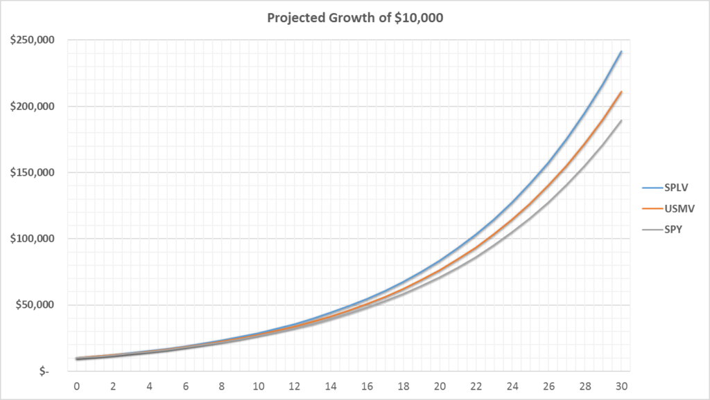
Stocks vs Bonds: A Visual Recap

Overview

Going back to 1928, these graphs give some historical context for the age-old conversation of investing in stocks versus Treasury bonds.1


Graph A: Cumulative returns since 1927 of investing $100 into either the S&P 500, 10yr Treasury Bond, or both (50/50 weighting). Please note that the scale of the graph is logarithmic.
Graph A: An introductory graph showing the cumulative returns since 1927 of investing $100 into either the S&P 500, 10yr Treasury Bond, or both (50/50 weighting). Please note that the scale of the graph is logarithmic.


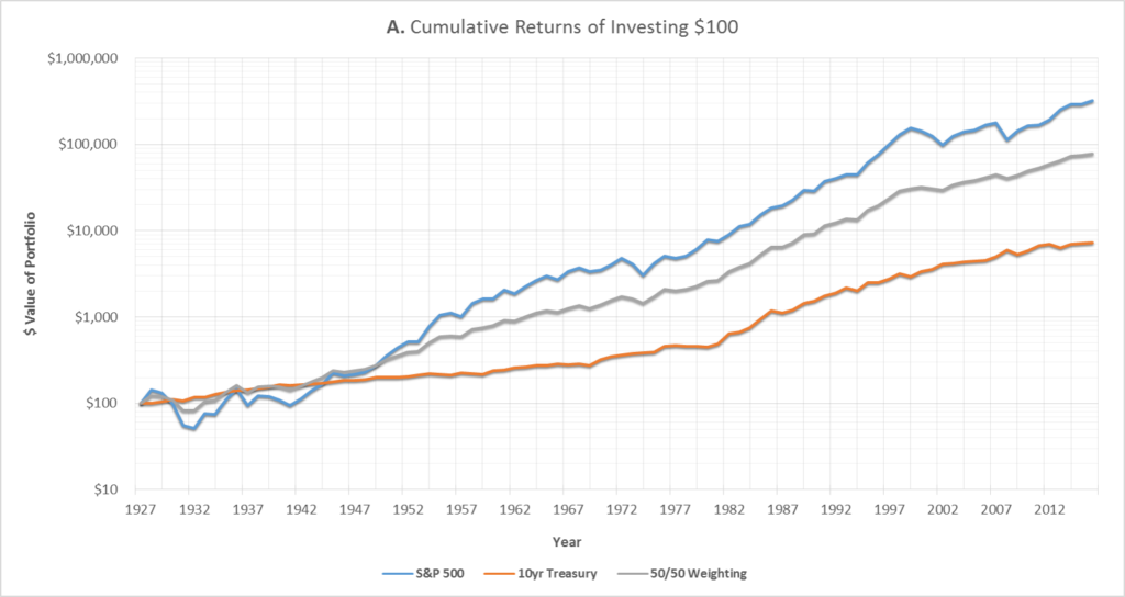
As shown in Graph A above,2 investing in the S&P 500 since 19283 would have returned nearly 4,500% more than investing in 10yr Treasury bonds.4 Assuming the initial investment was $100, the stock portfolio would have grown to above $320,000 vs only $7,000 for the bonds.5

However, this outperformance comes with a cost – the S&P 500 is significantly more risky.  As shown below in Graph B, the worst year for the stock portfolio was 1931, where the market lost 44% of it’s value.  If a portfolio had instead been 50/50 weighted in stocks and bonds, the loss for that year would have been reduced to 23%.

Graph B:
Graph B: The year-over-year (YoY) % returns for investing either in the S&P 500 or the 10yr Treasury.


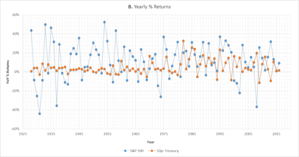
In 2008, bonds would have provided an even greater protection against loss.   If the portfolio had been 50/50 weighted, the 37% stock market loss would have been reduced to an only 8% loss.

The conventional narrative is that Treasuries are safe-haven assets – the theory is that they’re supposed to gain in value when the stock market is panicking since investors are assumed to be taking the proceeds from selling stocks and putting them into Treasuries.6

As shown above, it’s true that, at least in some extreme scenarios, bonds can retain their value while the stock market is tanking.  However, how has this relationship historically looked?

Graph C:
Graph C: The rolling correlation coefficient (blue line) and beta (black line) of the S&P 500 vs 10yr Treasury bonds.


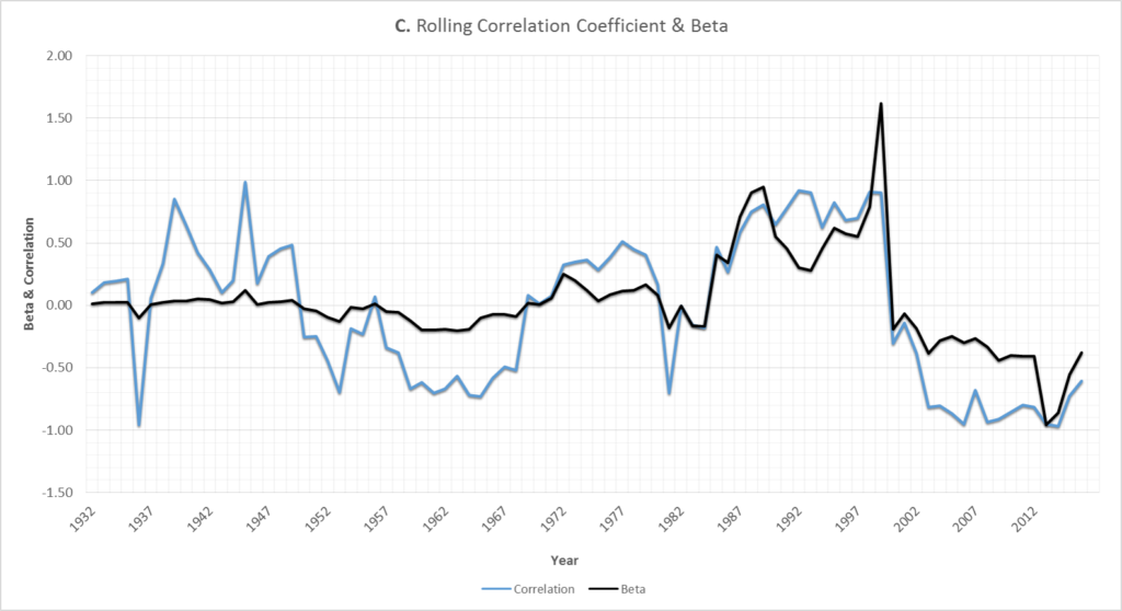
As shown in Graph C, it appears that, since around 2000, Treasuries have consistently moved in the opposite direction as stocks – in other words, the black (beta) and blue (correlation) lines are both comfortably below 0.

However, as shown above, the notion that Treasuries generally move in the opposite direction of stocks is a relatively recent phenomenon.

Looking at the bigger picture, the data indicates that there has been almost no long-term relationship between 10yr Treasuries and US stock returns – the average correlation coefficientfor the past 89 years has been just -0.04.8

There are periods when bonds move the same direction as stocks and when they move the opposite, but this relationship has fluctuated significantly over time – additionally, the beta9 for the entire 89 year time period is essentially zero (0.03).

Even when filtering down to periods of stock market stress where stocks have dropped by more than 10%, the expected inverse stock vs bond relationship hasn’t been especially reliable.  Stocks and bonds actually have a slightly positive correlation during these market downturns.

Something else to note from Graph C above is that bonds prices didn’t really move much up until around the 1980’s – the beta doesn’t even reach a magnitude of over 0.5 until then.

So it seems that something might have changed within the last 15 to 30 years. Displayed below in Graph D is the historical CPI10 and 10yr Treasury yield:

Graph D:
Graph D: A graph of how the 10yr yields have compared versus the Consumer Price Index (CPI).


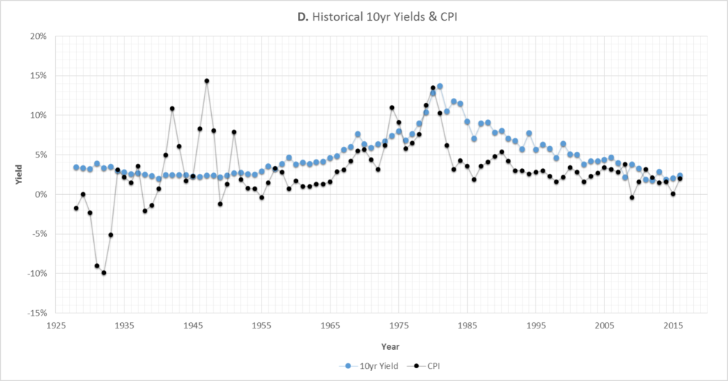
As shown, the CPI experienced huge swings up until the end of World War 2. Since then, the CPI and Treasury yields have had a relatively tighter relationship, which is at least what would be academically expected.11

The other big trend to notice is that yields have been almost falling almost continuously since 1981.  Since bond prices increase when yields decrease, this means that since 1981 bonds have been on average returning significantly more than just their coupon payments.

More specifically, due to the overall trend of yields falling over the past 35 years, price appreciation has accounted for approximately 1/3 of the total return from 10yr Treasuries (coupon income made up the other 2/3).

One other item to note is that, from a historical perspective, there isn’t much more room for Treasury yields to fall.12 There is, however, plenty of room for yields to rise and still be within their historical norms – which would likely mean significant losses for Treasury bond owners.

Graph E below illustrates this concept.  The x-axis is yields and the y-axis is the average total return from holding a Treasury over the subsequent 10 years.  For example, the top-right-most point (located at about 14% yield, 10% return) means that when a Treasury yielded 14%, the average return over the next 10 years averaged 10% per year.

Graph E:
Graph E: The relationship between the prevailing 10yr yield and the total Treasury returns over the next 10 years.


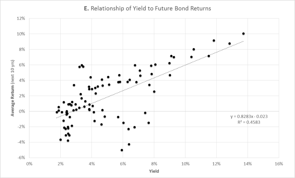
As shown, the general trend is that the lower the current yield, the lower the total return over the next 10 years.

Note that once yields get below 3%, historically these periods have actually been associated with an eventual average loss to bond owners.  A main factor to consider here would be, as mentioned above, yields don’t have much room to fall but have plenty of room to rise.

Back to discussing both stocks and bonds, Graph F below shows what the total risk/reward has looked like over the past 90 years.

Graph F:
Graph F: This efficient frontier graph displays how the risk/reward varies based on how much a portfolio is weighted towards either stocks (S&P 500) or bonds (10yr Treasuries).


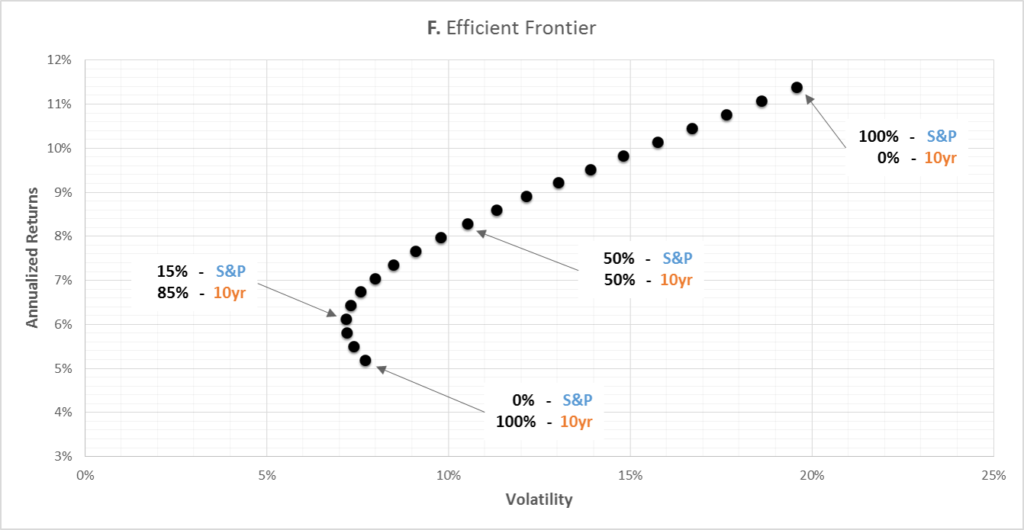
As shown (and as conventionally expected), stocks have shown both higher returns and higher volatility.

The average annual return of a 100% stock portfolio is 2.2x greater than a 100% 10yr Treasury portfolio, while the volatility of the stock portfolio is 2.5x greater than the volatility of the bond portfolio.

What about inflation?

So far, all returns discussed in this article have been without accounting for inflation.  As shown in Graph G below, once you account for inflation,10 the total returns for all investments are much smaller.

Graph G
Graph G: The same graph as Graph A (dotted lines) except the inflation-adjusted returns are now also displayed (solid lines).  For example, the inflation-adjusted Treasury returns are labeled ’10yr – CPI.’


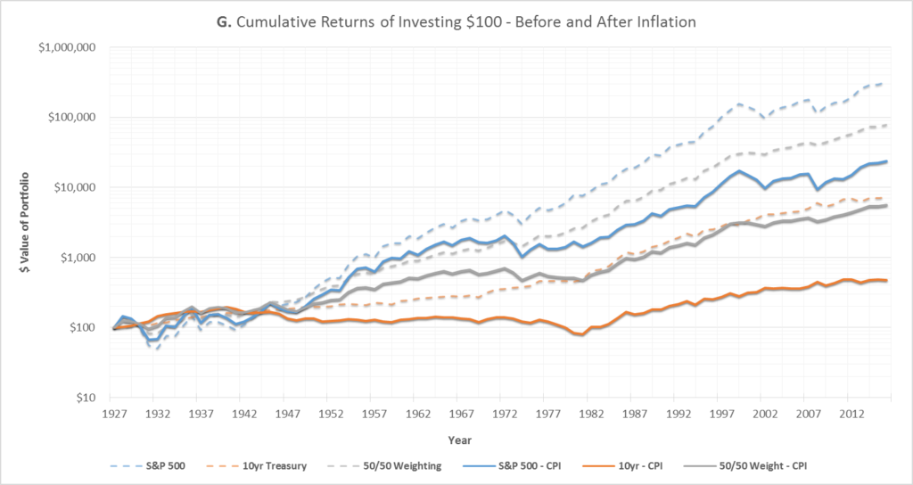
For investing $100 in the stocks-only portfolio back in 1928, the inflation-adjusted portfolio is now worth only $24,000, versus $320,000 before inflation.  It’s even more grim for the bonds-only portfolio: the inflation-adjusted portfolio is worth only $480, versus $7,200 before inflation.

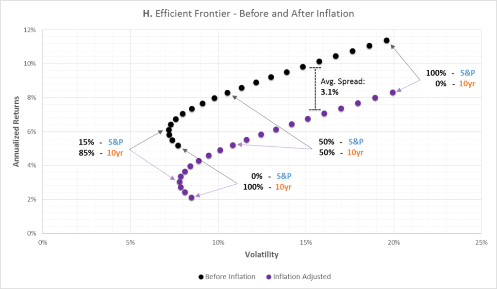
Finally, Graph H below shows what the risk/reward looks like both before and after inflation. The general risk/reward properties of the inflation-adjusted portfolio are similar to the pre-inflation portfolio – except now the inflation-adjusted portfolio approximately 3.1% lower annual returns, on average.

3.1% might not seem like much, but as previously shown in Graph G it could eventually be the difference between $24,000 and $320,000.

Graph H:
Graph H: The same graph as Graph F except inflation-adjusted numbers are now also included (in purple).


Putting it all together

When it comes to owning assets that are risk-free13 but still offer at least some return, Treasuries are hard to beat.  And since 1928, investing in Treasury bonds has certainly been less risky than investing in stocks.  However – especially after considering adjustments for inflation – some might say that this reduced risk could have been achieved at too great a cost.


Disclaimer

This is not investment advice–please see the disclaimer.


Notes

  1. For the purposes of this article, the S&P 500 is used to represent the stock portfolio and the 10yr Treasury bond is used to represent the bond portfolio.
  2. All taxes, fees, commissions, and market impact costs are assumed to be 0 for this article. Here is a link to the one of the data sources for this article.  Unless otherwise noted, the displayed returns are generated from annual data.
  3. Technically, the index used is the S&P Composite.  However, for simplicity and familiarity, I just used ‘S&P 500’ throughout the article, which would be accurate starting in 1957.
  4. Historical data for the 10yr Treasury was readily available going back to 1928, but most data providers only have 30 year Treasury data since the mid 70’s.
  5. All returns in this article are referring to total returns, or price appreciation + dividends/coupons.
  6. The reverse is also generally believed to be true in a market rally, where investors are getting the proceeds to buy stocks from selling Treasury holdings.
  7. For an explanation of the correlation coefficient, please visit here.
  8. Statistically, for practical purposes, this implies that there is essentially no relationship.
  9. For an explanation of beta, please visit here.
  10. I’m using CPI as a proxy for inflation.  Whether CPI is the best indicator of inflation is debatable, but it’s certainly one of the most standard measurements.
  11. Source
  12. It’s possible that Treasury yields will go negative – especially if major chaos hits the market.
  13. Risk-free refers to the chance of the United States defaulting on its debt, which most consider to be an extremely unlikely circumstance.  ‘Risk-free’ isn’t related to the risk of what happens to the real value of dollars if inflation were to skyrocket.

Bonds vs Bond Funds: A Calculator

In an uncertain yield environment, it can be difficult to estimate whether a bond vs bond fund will have a higher total return.  I made a spreadsheet to help clear up some confusion regarding when (and why) Treasury bond returns could differ from Treasury bond fund returns:


Partial screenshot of the bond vs bond fund calculator spreadsheet – clicking the image will download the spreadsheet.


Under various customizable yield curve scenarios, this spreadsheet allows you to illustrate how the returns compare between holding a new 10-year Treasury to maturity vs a hypothetical1 10-year Treasury fund.


Using the Spreadsheet: Overview

The default yield curve for this scenario initially matches the actual Treasury yield curve as of 12/1/16.2  This scenario then simulates, two years from today, a jump in the 10yr yield to 7% while the slope stays the same.  After that, the yield curve is unchanged for the next 8 years, when the single 10-year Treasury reaches maturity.

To simulate different yield curve scenarios3 over the next 10 years, you can plug in different values into the yellow cells within Box #1.

Box #1: You can change the values in the yellow boxes to modify the projected 10yr and 1yr yields over the next 10 years. For example, for time T+4yrs, a value of 7% for the 10yr yield would mean that in 4 years from now, the yield for Treasuries with 10 years of remaining maturity is 7%. For the 1yr yields, these are by default set to equal 10yr yields minus 1.6%.
Box #1: As an example, for time T+4yrs, the value of 7% for the 10yr yield would mean that, 4 years from now, the yield for Treasuries with 10 years of remaining maturity is 7%.


Within Box #2, Graphs A and B show the value of investing $100 into a 10yr Treasury vs Treasury fund, respectively.4  Graph C shows the fund returns minus the single bond returns.

Graph A: For the next 10 projected years, the black line represents the total projected value5 of investing $100 into a newly-issued 10yr Treasury – referred to as the single bond – and holding until maturity, 10 years from now.  The blue line is the price of the bond.6  The orange line tracks the cumulative coupons received,7 and the grey line is the coupon reinvestment income.8
Graph B: For the next 10 projected years, the black line represents the total projected value of investing $100 into our hypothetical 10yr Treasury fund.  The blue line is the value of just the bonds portion of the fund – so no coupons or coupon reinvestment income.  The orange line tracks the cumulative coupons received, and the grey line is the coupon reinvestment income.9
Graph C: This graph takes the total fund value from Graph B and subtracts the total bond value from Graph A. In other words, how do the total returns for investing in the fund compare to the total returns of buying the 10yr Treasury (single bond).


Interpreting the Spreadsheet

The default scenario shows that, even when yields rise by over 5%, the fund will outperform the bond.  In other words, if you were to buy a single 10yr Treasury and hold it until maturity (10 years from now), you’d get an 8% higher total return by instead buying our hypothetical Treasury fund and holding it over the same time period.

There are two central factors coming into play here: (Factor #1) differing sensitivity to yield changes and (Factor #2) differing returns due to the shape of the yield curve.

As shown in Graph D, over time the remaining maturity of the bond moves toward 0–standard for holding a bond.  However, the fund is trying to maintain a constant maturity of around 9 years.10 Starting at around T+2yrs, the average remaining maturity for the bond begins to significantly differ from the remaining maturity of the fund.

Graph D: A display of how the remaining maturity of the single bond decreases over time but the weighted-average remaining maturity of the fund stabilizes.10


Factor #1: Differing Sensitivity to Yield Changes

So why does the fund have increased sensitivity to yield changes?  Without using the word ‘duration,’ here is one (hopefully intuitive) explanation:11 Let’s assume you have two Treasuries, Y and Z, which both initially have yields and coupons that all equal 1% (so the yield curve is flat).  The difference is Bond Y matures in 5 years while Bond Z matures in 10 years.

yz1

Next let’s say that, for both bonds, yields jump from 1% to 3% – and remain that way for the next 5 years.  Now here is what we have:

yz2

Bond Z just dropped $7.90 more in price.  Why is that?  Some considerations:

  1. We know that Bond Y will be priced at $100 in 5 years – since it’s a Treasury, it’s considered risk-free and will return the par value of $100 at maturity.
  2. Both Bond Y and Bond Z will13 now offer an annual yield-to-maturity of 3%.
  3. Both coupons are fixed at 1%.
  4. So we need an extra 2% (roughly)14 of total annual return to make up for the yield minus coupon shortfall.
  5. That 2% can’t come from the coupon, so it has to come from price appreciation of the bond.

How much do the bond prices need to appreciate?  If these bonds had only one year to maturity, we can estimate that the bonds would drop to somewhere around $9815 because $2 price appreciation + $1 coupon would roughly get us to the market-mandated 3% yield.

So what changes as we examine remaining maturities that are greater than one year?  We can again estimate for two years remaining maturity that the price is going to fall to somewhere in the ballpark of $96 (two years of $2 price appreciation + $1 coupons).  The further the price falls, the more room there is for price appreciation.

Expanding this estimation logic to 5 or 10 years of remaining maturity, for a given yield increase, we can see that the price is going to have to fall further as the remaining maturity increases.  The yield minus coupon shortfall has to be remedied for each year of remaining maturity, and in this case it has to be made up for through price appreciation.  The more years that need to be made up for (as is especially the case for Bond Z vs Bond Y), the more the price needs to fall immediately.

Formalizing this logic leads us to the present value formulas (as used in the spreadsheet)–for a more in-depth discussion of these, please see here or here.


Factor #2: Differing Yields and YoY Returns

As mentioned above, in addition to having a higher sensitivity to yield changes, the Treasury fund will also have a higher yield than the single Treasury as time progresses.  As shown in Graph E, starting at T+2yrs, the fund yield starts to exceed that of the single Treasury.

Graph E: For each projected year, this shows a comparison of that the single bond’s yield looks like vs what the weighted average yield looks like for the fund.


The shape of the yield curve is the cause here.  Over time, the single Treasury goes from having 10 years of remaining maturity to 0 years – which means that the bond is going to yield less over time.16 So although the single Treasury, versus the fund, has less interest rate risk over time, in this case it also has a lower yield.

The extra price appreciation from rolling down the yield curve helps the single Treasury, but it’s ultimately not enough to offset its yield differential versus the bond fund (which is holding Treasuries with more remaining maturity).

Graph F, displaying the year-over-year (YoY) % returns, shows the result of this yield differential.

Graph F: For each projected year, this shows what the % returns would be for each year for the single bond vs the fund. For example, if the total value of the fund was at $95 and then a year later was at $85, the value for the latter year would be ($85-95)/$95 = 10.5%.17


The fund significantly underperforms the single Treasury at T+2yrs – this is when yields jumped, and as expected the fund lost more value because it had a higher sensitivity to yield changes.  However, starting at T+3yrs, the fund YoY starts to catch up to the single Treasury, and at T+5yrs the fund has caught up and begins to cumulatively outperformed the single Treasury.


Summary of Factors #1 and #2:

The fund has a higher average maturity and therefore has higher sensitivity to yield changes. When yields increase, the fund will lose more than the single Treasury.  However, assuming the standard positive slope, the fund will yield more than the single Treasury and eventually outperform the single Treasury.


Description of the other parts of the spreadsheet:

Box #2: The location of all the graphs (updated every time the sheet is modified).

Box #3

box3

Based on the yields entered in Box #1, this is the projected bond math18 for the single 10yr Treasury over the next 10 years.  The time axis runs vertically from top to bottom and is the same for Boxes #4 and #5.  Note: the orange cells (coupon)19 can also be modified, but these default to equaling the 10yr yield for when the particular bond was issued.

Box #4

box4

Based on the yields entered in Box #1, this is the projected bond math for the 10yr Treasury fund – in this case assumed to be a hypothetical ETF.1 The time axis is the same as in Boxes #3 and #5. The green cells show the # of bonds that the fund would hold at that moment in time.  Each period represents the time immediately after a fund rolled into its annually-updated bond rebalance.  These numbers represent fractional bond positions and not % weightings – the actual weighting between the two bonds is 50/50 after each roll (by assets invested).20

Box #5

box5

Based on the yields entered in Box #1, this is the projected bond math for each relevant 10yr Treasury that will be (at some point) held by the fund.  Bond B refers to the bond issued one year after our single Treasury bond (which is also labeled as Bond A), Bond C is the bond issued one year after Bond B, etc.

The vertical time axis is the same as in Boxes #4 and #5. Only the relevant time slices are shown for each bond21.  The orange coupon boxes follow the same convention as in Box #3.


Other notes and observations

  1. For the fund, even when yields are unchanged for multiple years (as happens in our default scenario), the value of the bonds from Graph B could still be increasing–this would be due to roll down within the 8 to 10yr yield curve since the slope is set to a non-zero value.
  2. If the yield curve were to stay unchanged for the next 10 years, the fund would cumulatively outperform the single 10yr Treasury by over 13%–this fund outperformance would be solely due to the upward slope of the yield curve.  If there were slope then the fund and single Treasury returns would be equivalent.
  3. Starting again at a 10yr yield 2.4% initially, let’s instead say that in two years the 10yr yields rise to 25% and stay there.  The Treasury ETF would still have a higher total return than a 10yr Treasury held to maturity.  Yields would have to jump to 26% before the single Treasury would outperform the fund.  This is again due to the upward slope of the yield curve.
  4. Regarding the applicability of this spreadsheet to other types of bonds (mainly municipal and corporate), Treasuries are probably the simplest type of bond to consider.  Since these are assumed to be risk free, among other considerations, there’s no credit spread, variable credit ratings, defaults, special provisions, recovery values, callability, or credit spread dependencies on remaining maturity.  Additionally, the liquidity of many municipal and corporate bonds is much lower than Treasuries, so the mark-to-market assumptions made in the spreadsheet would be less practical.
  5. If the spreadsheet’s single bond hold-until-maturity strategy were replaced by a bond laddering strategy, the returns for holding bonds directly would then be much more similar to the bond fund returns.
  6. Let me know if you see any mistakes; I’ll be happy to discuss and update this page and spreadsheet.


Disclaimer

This is not investment advice – please see the disclaimer.

Footnotes

  1. This is a hypothetical, simplified ETF where fractional bond positions are allowed and all assets are considered to be invested at all times (at various yields, as discussed later). Discounts/premiums to NAV are assumed to be 0, which in the case of Treasury ETFs is generally a reasonable assumption, +/- a few basis points.  The index this hypothetical ETF would be tracking would be Treasuries with remaining maturities of 8.5 to 10 years. This compares with the IEF ETF, which targets a Treasury index with remaining maturities of 7 to 10 years.  In terms of mutual bond funds vs ETF bond funds, the total returns would end up being functionally similar in this case, regardless of the type of fund. 
  2. 10yr yield: 2.4%, 10yr – 1yr: 1.6%
  3. For the 2 to 9 year section of the projected yield curve, these yields are interpolated based on the entries for the 10yr and 1yr yields.  The 1yr yields are by default set to equal the 10yr yields minus 1.6%.
  4. For simplicity, all examples discussed here assume that taxes, fees, commissions, and bid/ask spreads are all 0.
  5. At each point in time, the Treasury investment has a resale value.  Although some holders of Treasuries are not interested in, for example, what the value of their 10-year bond is with 5 years until maturity (since they plan on holding it until maturity), their bond still has a relatively efficient value on the open/secondary market.
  6. Since the time snapshots are taken at the same interval as the coupon payments, the clean price will equal the dirty price, note 2: when a Treasury’s coupon is less than the market-determined yield (for its maturity), the bond will trade at less than par value ($100).  This is sometimes referred to trading at a discount.
  7. This spreadsheet assumes only one coupon payment per year.
  8. The coupons are assumed to be reinvested at the prevailing yield for the remaining maturity of this single bond.
  9. The coupons are assumed to be reinvested at the weighted average of its portfolio’s prevailing yield for the remaining maturity of the bonds.
  10. The target maturity isn’t realized until T+1yr because (for simplicity) that is the first time a 2nd bond is available to be placed in the fund.  Also, although the fund’s remaining maturity is shown stabilizing at 9.5 years on the graph, in reality that number is fluctuating between 8.5 years and 9.5 years.  For simplicity, these graphs are only showing one point of time for each year, and that point of time happens to be right when the fund rolls out of the older bond and into the  newly issued bond (with 10 years of maturity remaining).
  11. For more standard explanations of this topic, please see here or here.
  12. Following the convention of the other hypothetical Treasuries discussed so far, Bond Y and Bond Z both also pay out coupons annually so when taking annual time slices, the clean price = dirty price.
  13. This must hold to avoid arbitrage scenarios where a trading firm could make a risk-free profit by exploiting the inefficiency in the yield curve.
  14. To keep things simple I’m ignoring the coupon reinvestment income for now.
  15. The actual number is $98.06.
  16. In general, the further a Treasury is from maturing, the higher its yield.  Here is one explanation of why the yield curve is usually sloped like this–one theory is that it’s largely because Treasury investors think the risk (both inflationary and default) of holding US government’s interest rate risk is a smaller problem short-term than long-term.
  17. If yields have been unchanged for at least a year AND the slope is 0 (so no roll down), this value should equal the prevailing yield for the appropriate remaining maturity.
  18. The yields for all bonds are interpolated from the entries in Box #1.
  19. For simplicity, coupons are assumed to be paid annually.
  20. The 50/50 weighting calculation does not consider the accumulated coupon income (which would have been eventually paid out by the fund in dividends) but is kept here to maintain an apples to apples comparison.
  21. For cleanliness, the numbers for bonds are not shown if they the bond has no current relationship with the fund.

Low Volatility ETFs: The Bigger Picture

There’s been a decent amount of debate about low-volatility funds over the past year – depending on who you ask, these funds are either great with solid academic support or a quickly-passing fad.

It’s gotten a bit confusing about whether these low-volatility funds actually belong in the average investor’s portfolio, so I took a look at the available historical data and here is what I have so far:

Summary: Since 1990, low-volatility strategies have outperformed index funds in almost every major category–even after accounting for recent market turmoil.

The Data

For this article, I’m going to focus on two of the most popular low-volatility ETFs: SPLV and USMV. These ETFs have by far attracted the most assets amongst domestic low-volatilty funds–and correspondingly the most news coverage.  For our purposes, the most significant difference between the two is probably that SPLV selects stocks only from the S&P 500 while USMV does not have that restriction.1

I’m going to keep things simple for now and use the SPY ETF as the reference asset–its underlying index is either the same as the parent index (for SPLV) or relatively close to the parent index (for USMV).

The basics: what has the performance looked like?

The total returns for SPY, SPLV, and USMV
The total returns for SPY, SPLV, and USMV, generated with weekly data from November 1990 to November 2016


For each ETF, this graph shows what a $100 investment would have theoretically grown to over the past 26 years.2 For dates preceding each fund’s inception date, their index is used as a proxy3–the returns are pre-tax but include the estimated fund fees.4

As we can see, both low-volatility funds have had higher total returns than SPY–but without looking at the historical volatility, we’re not seeing the whole picture.

What has the volatility looked like?

Historical volatility graph
Historical volatility: one year rolling windows (weekly returns) for SPLV, USMV, and SPY


As we can see, it seems that SPLV and USMV have been generally delivering on their goal of having lower volatility than the broader markets, with SPLV averaging lower volatility than USMV (discussed below). Their volatilities have been higher relative to SPY recently, but these levels aren’t unprecedented.

Measuring the relative volatilities is certainly helpful, but it can also be useful to check whether the funds act differently in rising versus falling markets.  This brings us to a related measurement: up and down capture ratios.

A closer look: up/down capture ratios

For those of us not familiar with the concept of up/down capture, essentially it’s a set of two ratios that calculate a fund’s sensitivity to up and down movements of the broader markets.  In short, you want your fund to have high up-capture and low down-capture.  The historical ratios5 are shown below:

A graph of the historical up capture ratio for SPLV and USMV
A graph of the up capture ratio (y-axis) for SPLV and USMV.  SPLV averages 0.71, and USMV averages 0.80.
The historical down-capture ratio for SPLV and USMV
The historical down-capture ratio (y-axis) for SPLV and USMV.  SPLV averages 0.61 and USMV averages 0.69.


For SPLV, we do see it had some struggles during the dot-com bubble of the late 90’s/early 00’s, and this gets directly reflected when the up-ratio drops below 0 (negative values mean that the fund was moving in the opposite direction of the reference fund, or SPY in this case).

Additionally, as referenced in the graph captions, note that SPLV has generally lower ratios than USMV, which makes sense given that SPLV has also shown generally lower volatility than USMV.

Overall, what these two graphs are generally showing is that the up and down capture ratios are both generally less than one, which makes sense in the context of low-volatility strategies.

Ok, so the capture ratios look roughly as theoretically expected for these funds…but is there an underlying driver for the recent uptick in relative volatility?  A possible explanation relates to SPLV and USMV inflows.

Aside: the mechanics and impact of inflows into low-volatility ETFs

This topic has been discussed extensively elsewhere (for example here and here).

So why would fund inflows–also known as net creations–matter? Essentially, the simplified version can be thought of like this:

inflows_lv
A simplified flow chart illustrating how ETF demand actually impacts the underlying assets


The net impact: while there is no net demand imbalance for the ETF (the buying and selling netted out), there was a net demand imbalance on the underlying shares–which are the assets of the fund.  In other words, a lot of new money was invested into the assets underlying the ETF, driving up the value of those assets relative to the broader market.6

Going back to SPLV and USMV, on average both funds saw relatively sharp inflows in 2016 (on average increasing their total assets by about 25% YTD), with the fund assets peaking a few months ago.

Bigger picture, this period of increased fund flows (both in and out of the fund) is occurring at around the same time that we’re seeing increased relative volatility–especially within the last few months.7

My perspective: although the low-volatility fund flows have been noteworthy during the last year or so, focusing on this dynamic distracts from the bigger picture: over the past 26 years, these indices have provided both lower risk and higher returns than the S&P 500.

A Modern Portfolio Theory perspective

Briefly, another way of visualizing the data is to see what the efficient frontier graphs look like for various weightings of SPY/SPLV and SPY/USMV:

What the efficient frontier risk/reward graph looks like for SPY vs SPLV and SPY vs USMV using our entire dataset (since 1990).


What these graphs are essentially showing is that, over the past 26 years, SPLV and USMV almost completely dominate the S&P 500–both from a risk and reward perspective.

Some real-world investment dollar implications are discussed in the next section.

Potential $-value projections

Assuming that (1) the volatilities and (2) the average returns remain close to their historical levels [this is a huge assumption, but we don’t really have an obviously better option], here is what a hypothetical $10,000 investment in SPLV, USMV, or SPY could look like over the next 30 years:8

projected_growth_lv
Projected growth of an initial $10,000 investment in SPV, USMV, or SPLV.


In other words, investing in SPLV instead of SPY could hypothetically result in an additional $50,000+ after 30 years.  That 0.9% difference in annual returns can really add up–here’s what the dollar difference in growth is over the same period:

projected_growth_diff_lv
Projected growth differential of $10,000 for SPLV vs SPY and USMV vs SPY


Putting it all together

Overall, since index inception, the data seems to be showing the low-volatility strategies have generally shown higher returns, lower risk, solid participation in market gains, and adequate protection from market declines.9

Summary table for low-volatility ETFs
Summary data from the graphs discussed in this article


What do you think?

This article is a work in progress, so I’m sure I missed something.  Feel free to email me or comment below!

Disclaimer

This is not investment advice–please see the disclaimer


Notes

  1. Technical note for USMV’s market cap match with SPY/SPLV: According to Morningstar, the average market cap for USMV’s components is $43B and the average market for SPLV’s components is $33B.  I’ve heard various people comment that, vs SPLV or SPY, USMV theoretically has a higher exposure to mid-cap indices.  While I agree that this could be true in theory, the data suggests otherwise.
  2. Note on index timing: December 1990 is the first time all three indices had data available.  Fund inception dates: SPY-January 1993; SPLV-May 2011; USMV: October 2011.
  3. In terms of whether these pre-fund-inception returns are just curve-fitted and unrealistic, at least for SPLV it’d be harder to argue that since the index methodology is so plain-vanilla.
  4. These graphs are showing total returns, assuming the reinvestment of dividends.  Note on the fee assumptions: for date’s preceding each fund’s launch date, I retroactively added in the current fund fee for each ETF–essentially assuming that you could have invested in the index after accruing fees that are equivalent to today’s fund fees.
  5. These up and down capture ratios were determined as follows: using monthly data (to avoid noisy/small market moves in the weekly data), calculate the average up or down ratio over the past 12 months.
  6. The same type mechanism would generally play out for fund outflows, although some would argue that it could be much more chaotic–especially for ETFs with illiquid assets.
  7. Some might say that the long-term low-volatility ETF outperformance is solely due to abnormal net fund inflows, but I wouldn’t go that far.  The outperformance of the indices (relative to at least SPY) has been happening since at least the 2008-09 financial crisis–well before SPLV or USMV could even experience an inflow (they didn’t exist yet).
  8. We’re using the same fee/tax assumptions as used in the rest of this article.
  9. Whether these factors maintain their historical performance…that’s a completely different question.