
There’s been a decent amount of debate about low-volatility funds over the past year – depending on who you ask, these funds are either great with solid academic support or a quickly-passing fad.
It’s gotten a bit confusing about whether these low-volatility funds actually belong in the average investor’s portfolio, so I took a look at the available historical data and here is what I have so far:
Summary: Since 1990, low-volatility strategies have outperformed index funds in almost every major category–even after accounting for recent market turmoil.
The Data
For this article, I’m going to focus on two of the most popular low-volatility ETFs: SPLV and USMV. These ETFs have by far attracted the most assets amongst domestic low-volatilty funds–and correspondingly the most news coverage. For our purposes, the most significant difference between the two is probably that SPLV selects stocks only from the S&P 500 while USMV does not have that restriction.1
I’m going to keep things simple for now and use the SPY ETF as the reference asset–its underlying index is either the same as the parent index (for SPLV) or relatively close to the parent index (for USMV).
The basics: what has the performance looked like?
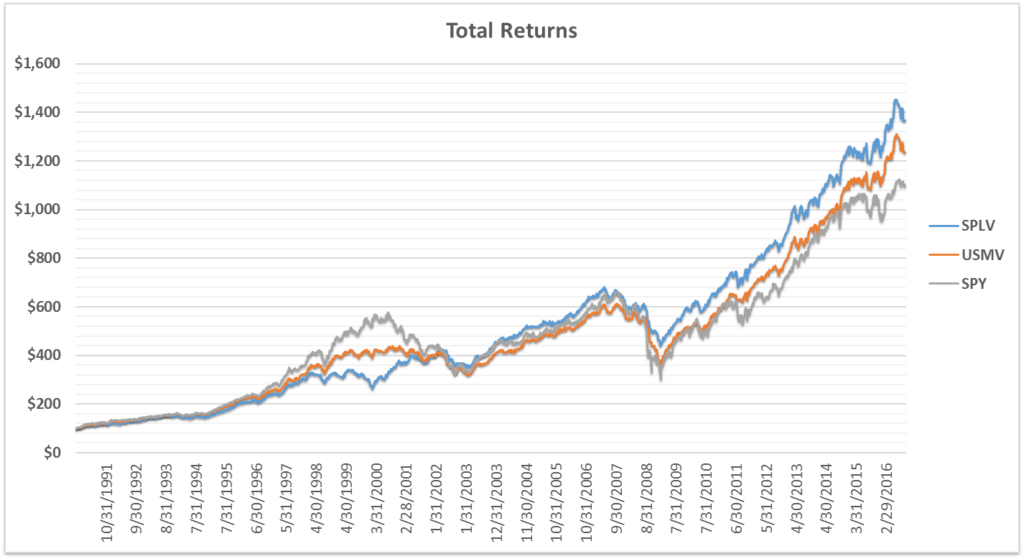
For each ETF, this graph shows what a $100 investment would have theoretically grown to over the past 26 years.2 For dates preceding each fund’s inception date, their index is used as a proxy3–the returns are pre-tax but include the estimated fund fees.4
As we can see, both low-volatility funds have had higher total returns than SPY–but without looking at the historical volatility, we’re not seeing the whole picture.
What has the volatility looked like?
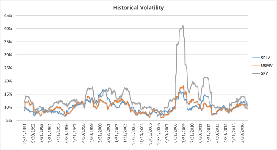
As we can see, it seems that SPLV and USMV have been generally delivering on their goal of having lower volatility than the broader markets, with SPLV averaging lower volatility than USMV (discussed below). Their volatilities have been higher relative to SPY recently, but these levels aren’t unprecedented.
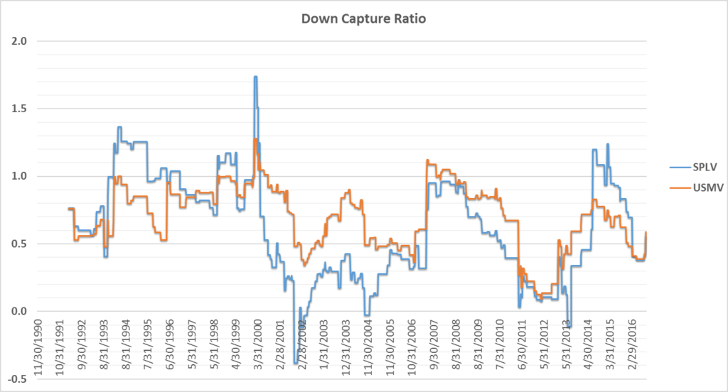
Measuring the relative volatilities is certainly helpful, but it can also be useful to check whether the funds act differently in rising versus falling markets. This brings us to a related measurement: up and down capture ratios.
A closer look: up/down capture ratios
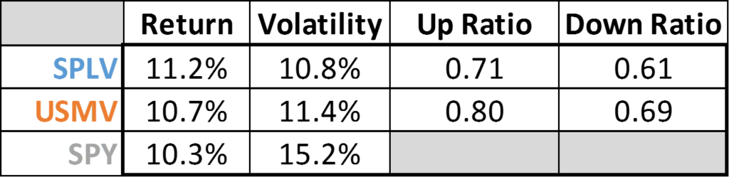
For those of us not familiar with the concept of up/down capture, essentially it’s a set of two ratios that calculate a fund’s sensitivity to up and down movements of the broader markets. In short, you want your fund to have high up-capture and low down-capture. The historical ratios5 are shown below:
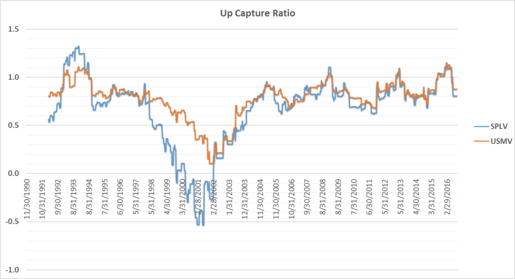
For SPLV, we do see it had some struggles during the dot-com bubble of the late 90’s/early 00’s, and this gets directly reflected when the up-ratio drops below 0 (negative values mean that the fund was moving in the opposite direction of the reference fund, or SPY in this case).
Additionally, as referenced in the graph captions, note that SPLV has generally lower ratios than USMV, which makes sense given that SPLV has also shown generally lower volatility than USMV.
Overall, what these two graphs are generally showing is that the up and down capture ratios are both generally less than one, which makes sense in the context of low-volatility strategies.
Ok, so the capture ratios look roughly as theoretically expected for these funds…but is there an underlying driver for the recent uptick in relative volatility? A possible explanation relates to SPLV and USMV inflows.
Aside: the mechanics and impact of inflows into low-volatility ETFs
This topic has been discussed extensively elsewhere (for example here and here).
So why would fund inflows–also known as net creations–matter? Essentially, the simplified version can be thought of like this:
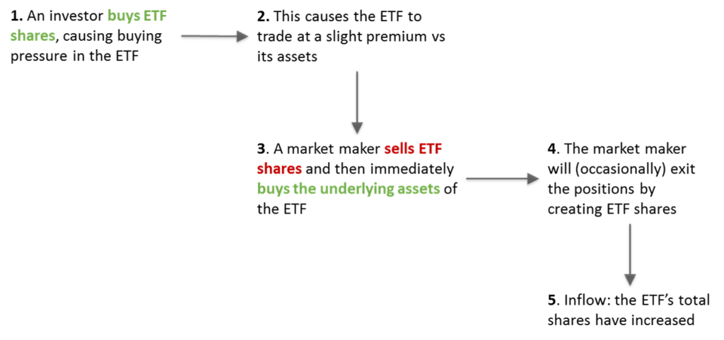
The net impact: while there is no net demand imbalance for the ETF (the buying and selling netted out), there was a net demand imbalance on the underlying shares–which are the assets of the fund. In other words, a lot of new money was invested into the assets underlying the ETF, driving up the value of those assets relative to the broader market.6
Going back to SPLV and USMV, on average both funds saw relatively sharp inflows in 2016 (on average increasing their total assets by about 25% YTD), with the fund assets peaking a few months ago.
Bigger picture, this period of increased fund flows (both in and out of the fund) is occurring at around the same time that we’re seeing increased relative volatility–especially within the last few months.7
My perspective: although the low-volatility fund flows have been noteworthy during the last year or so, focusing on this dynamic distracts from the bigger picture: over the past 26 years, these indices have provided both lower risk and higher returns than the S&P 500.
A Modern Portfolio Theory perspective
Briefly, another way of visualizing the data is to see what the efficient frontier graphs look like for various weightings of SPY/SPLV and SPY/USMV:
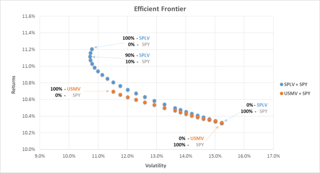
What these graphs are essentially showing is that, over the past 26 years, SPLV and USMV almost completely dominate the S&P 500–both from a risk and reward perspective.
Some real-world investment dollar implications are discussed in the next section.
Potential $-value projections
Assuming that (1) the volatilities and (2) the average returns remain close to their historical levels [this is a huge assumption, but we don’t really have an obviously better option], here is what a hypothetical $10,000 investment in SPLV, USMV, or SPY could look like over the next 30 years:8
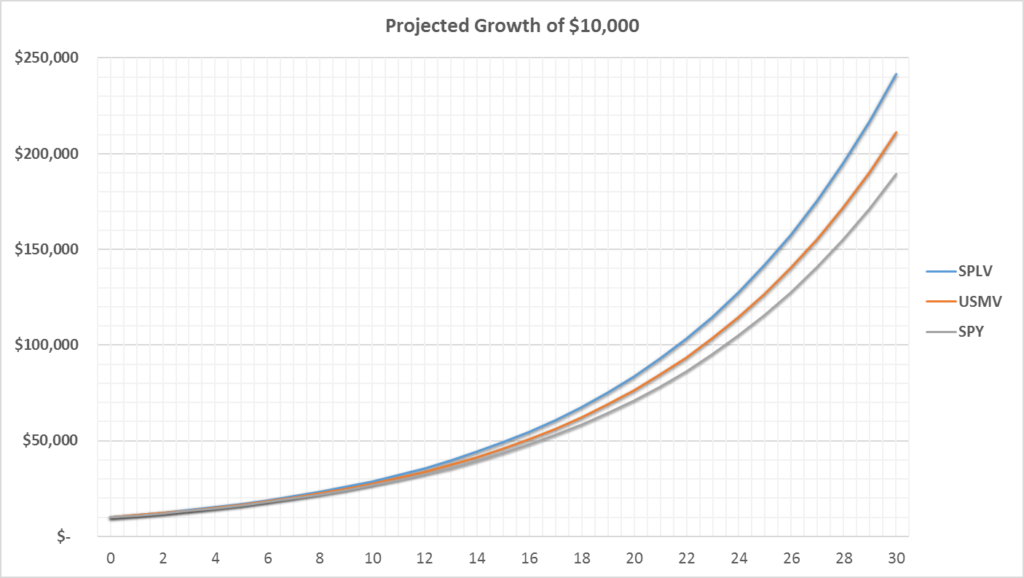
In other words, investing in SPLV instead of SPY could hypothetically result in an additional $50,000+ after 30 years. That 0.9% difference in annual returns can really add up–here’s what the dollar difference in growth is over the same period:

Putting it all together
Overall, since index inception, the data seems to be showing the low-volatility strategies have generally shown higher returns, lower risk, solid participation in market gains, and adequate protection from market declines.9
What do you think?
This article is a work in progress, so I’m sure I missed something. Feel free to email me or comment below!
Disclaimer
This is not investment advice–please see the disclaimer
Notes
- Technical note for USMV’s market cap match with SPY/SPLV: According to Morningstar, the average market cap for USMV’s components is $43B and the average market for SPLV’s components is $33B. I’ve heard various people comment that, vs SPLV or SPY, USMV theoretically has a higher exposure to mid-cap indices. While I agree that this could be true in theory, the data suggests otherwise.
- Note on index timing: December 1990 is the first time all three indices had data available. Fund inception dates: SPY-January 1993; SPLV-May 2011; USMV: October 2011.
- In terms of whether these pre-fund-inception returns are just curve-fitted and unrealistic, at least for SPLV it’d be harder to argue that since the index methodology is so plain-vanilla.
- These graphs are showing total returns, assuming the reinvestment of dividends. Note on the fee assumptions: for date’s preceding each fund’s launch date, I retroactively added in the current fund fee for each ETF–essentially assuming that you could have invested in the index after accruing fees that are equivalent to today’s fund fees.
- These up and down capture ratios were determined as follows: using monthly data (to avoid noisy/small market moves in the weekly data), calculate the average up or down ratio over the past 12 months.
- The same type mechanism would generally play out for fund outflows, although some would argue that it could be much more chaotic–especially for ETFs with illiquid assets.
- Some might say that the long-term low-volatility ETF outperformance is solely due to abnormal net fund inflows, but I wouldn’t go that far. The outperformance of the indices (relative to at least SPY) has been happening since at least the 2008-09 financial crisis–well before SPLV or USMV could even experience an inflow (they didn’t exist yet).
- We’re using the same fee/tax assumptions as used in the rest of this article.
- Whether these factors maintain their historical performance…that’s a completely different question.